 Ice LogoCursor
01Web design · Scroll
v1.0.0Horizontal Sticky Stack
A vanilla CSS horizontal scroll section where cards stick and stack as you scroll through.
- Section
- Web design
- Kind
- Scroll
- Published
- Built with
- CSS
- Version
- 1.0.0
- Tech
- CSS Animations, CSS Scroll-Driven Animations, CSS Custom Properties, TypeScript
npx vanilla-motion add horizontal-sticky-stack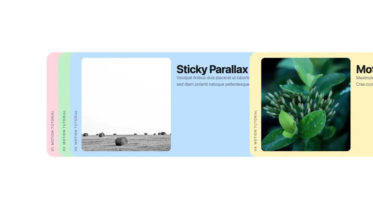
Published Jul 14, 2026.
02How to use
Three ways- 01Customize it
Tune every value in the app until it looks right.
- 02Copy the embed
Settings are data-* attributes on the element, in kebab-case.
<div data-horizontal-sticky-stack style="height:480px"></div> <script src="https://vanilla-motion.com/embed/horizontal-sticky-stack/1.0.0/horizontal-sticky-stack.js"></script> - 03Paste it on your site
Anywhere that takes HTML: an Embed element in Webflow or Framer, a Custom HTML block in WordPress, or straight into your page.
- 01Connect once
Add it as an MCP server (or custom connector) in Claude, ChatGPT, Cursor, VS Code or any app that supports MCP.
https://mcp.vanilla-motion.com/mcp - 02Ask for it
In your project, ask:
Add Horizontal Sticky Stack to this project. - 03What it reads
The same files are open to any tool, with or without the MCP.
- 01shadcn
In a project that uses shadcn:
npx shadcn@latest add https://vanilla-motion.com/r/horizontal-sticky-stack.json - 02Any project
Copies the source into ./vanilla-motion/horizontal-sticky-stack/ and lists the packages it needs.
npx vanilla-motion add horizontal-sticky-stack - 03Use it
import { mount } from "./vanilla-motion/horizontal-sticky-stack/horizontal-sticky-stack";

const fx = mount(document.querySelector("#my-effect"), { /* params */ });
fx.setParams({ /* change any param later */ });
fx.dispose();
03Case study
1 min readA scroll-driven layout where cards pin in place and stack horizontally as the user scrolls down. This pattern creates a sense of depth and sequence, commonly used for feature showcases and product walkthroughs.
What makes this tutorial special: the motion is pure CSS using animation-* — no JavaScript runs while you scroll. (The effect’s small script only builds the cards and writes your settings as CSS variables.) Note that scroll-driven animations are not supported on Firefox at the time of this writing.
Step 1: The first stack
My approach for complex layouts always starts with the static layout and a proper box model first.
Step 2: Static, responsive layout
Then proceed with the complete layout for both desktop and mobile. No need to put 100% effort into this step — it’s just a prep so we have in mind how the mobile layout will look.
At this step, since we are aware that there’s animation to apply, be a bit more generous with HTML elements — allow more wrappers, each handling a specific purpose. One wrapper for
sticky, one for sizing withwidthandheight, one fortransform. This helps avoid CSS conflicts in the animation steps.
Step 3: Sticky
Here comes the fun part. Implement the animation once the static layout is ready.