 Ice LogoCursor
01UI · Shape
v1.0.0CSS Tab Shape
Create tab shapes using CSS mask and clip-path: shape() techniques
- Built with
- CSS
- Version
- 1.0.0
- Tech
- CSS Mask, CSS Clip-path, CSS shape()
npx vanilla-motion add css-tab-shape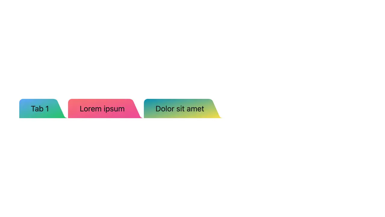
Published Jul 20, 2026.
02How to use
Three ways- 01Customize it
Tune every value in the app until it looks right.
- 02Copy the embed
Settings are data-* attributes on the element, in kebab-case.
<div data-css-tab-shape style="height:480px"></div> <script src="https://vanilla-motion.com/embed/css-tab-shape/1.0.0/css-tab-shape.js"></script> - 03Paste it on your site
Anywhere that takes HTML: an Embed element in Webflow or Framer, a Custom HTML block in WordPress, or straight into your page.
- 01Connect once
Add it as an MCP server (or custom connector) in Claude, ChatGPT, Cursor, VS Code or any app that supports MCP.
https://mcp.vanilla-motion.com/mcp - 02Ask for it
In your project, ask:
Add CSS Tab Shape to this project. - 03What it reads
The same files are open to any tool, with or without the MCP.
- 01shadcn
In a project that uses shadcn:
npx shadcn@latest add https://vanilla-motion.com/r/css-tab-shape.json - 02Any project
Copies the source into ./vanilla-motion/css-tab-shape/ and lists the packages it needs.
npx vanilla-motion add css-tab-shape - 03Use it
import { mount } from "./vanilla-motion/css-tab-shape/css-tab-shape";

const fx = mount(document.querySelector("#my-effect"), { /* params */ });
fx.setParams({ /* change any param later */ });
fx.dispose();
03Case study
2 min readCreate tab shapes using CSS mask and clip-path: shape() techniques.
Tab UI with CSS mask
- Apply normal paddings
- Create a border around the tab, as we will mask out everything from this border outward.
.tab {
  @apply bg-blue-400 px-3 py-1;

  --r: 12px;
  @apply rounded-t-(--r);

  border: var(--r) solid red;
  border-bottom: 0;
}- Use mask with 3 layers to cut out the
redborder
.tab {
  /*...*/

  mask: linear-gradient(#000) padding-box,
  radial-gradient(100% 100% at 0 0, #0000 98%, #000) 0 100% / var(--r) var(--r),
  radial-gradient(100% 100% at 100% 0, #0000 98%, #000) 100% 100% / var(--r) var(--r);
  mask-repeat: no-repeat;
}- Finish with hover status
Clip path shape()
This approach using clip-path: shape(), a modern function of clip path. This solve the box model issue of using mask.
.tab {
  @apply bg-transparent px-8 py-2 text-center;
  transition: background-color .3s ease;

  --r: 12px;

  clip-path: shape(
    from 0 100%, /*1. start from bottom left corner*/
    arc by var(--r) calc(-1 * var(--r)) of var(--r), /*2. create an arc then draw a vertical line up*/
    vline to var(--r),
    arc by var(--r) calc(-1 * var(--r)) of var(--r) cw, /*3. top left rounded corner*/
    hline to calc(100% - 2 * var(--r)), /*4. draw a horizontal line to the next corner*/
    arc by var(--r) var(--r) of var(--r) cw, /*5. top right rounded corner*/
    vline to calc(100% - var(--r)), /*6. vertical line down*/
    arc by var(--r) var(--r) of var(--r), /*7. bottom right inward radius and close*/
    close
  );
}
Tabs with folder shape
.tab {
  @apply pl-6 pr-10 py-2 text-center;
  --r: 8px;

  clip-path: shape(
    from 0 100%,
    vline to var(--r),
    arc by var(--r) calc(-1 * var(--r)) of var(--r) cw, /*top left rounded corner*/
    hline to calc(100% - 4 * var(--r)),
    curve to calc(100% - 22px) 5px with calc(100% - 24px) 0px, /*top right rounded corner*/
    line to calc(100% - 8px) calc(100% - 4px),
    curve to 100% 100% with calc(100% - 6px) 100%, /*!*bottom right rounded corner*/
    line to 100% 100%,
    close
  );
}